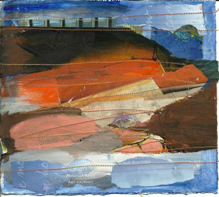
This composition uses two complimentary colors (opposites on the color wheel) and is another in my series of color studies that I am creating in Jane Davies’ online class Unlocking the Secrets of Color.
I started with some magazine images in blue and orange. I found my original composition very busy with lots of visual images and colors not in my chosen color palatte. I simplified the design by covering most of the colors outside my palatte with paint mixed from blue and orange plus occasional bits of white and black. I left a little of the yellow and purple in the original magazine scraps. I like the contrast between areas of saturated color and the neutrals that resulted from mixing orange and blue or adding white or black.
