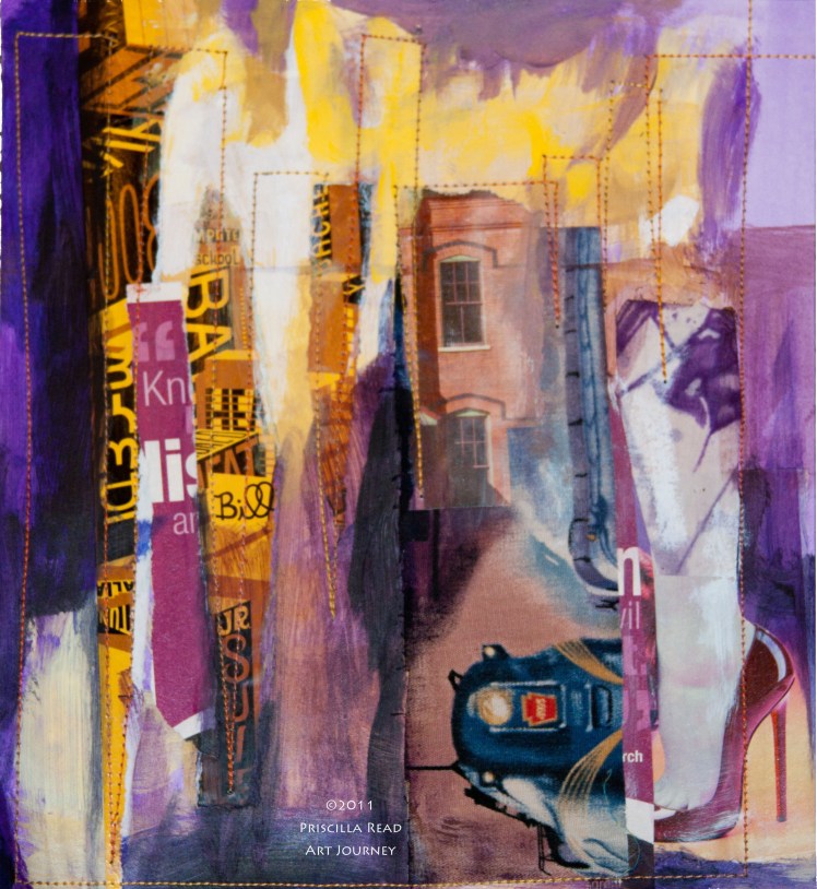
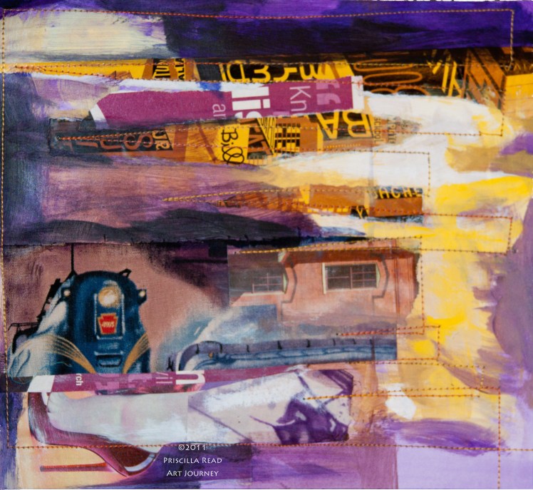
This Yellow and Purple Collage
is another example of complimentary colors for the series of color studies I’m creating in Jane Davies’ online class Unlocking the Secrets of Color.
They say a good composition will look just as good upside down. In the case of my latest color study – I’m still deciding if I like the composition better as I originally created it – in a portrait orientation – or sideways.
What do you think?
My original orientation has strong vertical lines and the cityscape feeling I was going for.
I find that different elements become more prominent in the landscape orientation.
Photographing the collage then rotating it in Photoshop Elements so I can see the different orientations side by side is a helpful way to step back and look at the work.


Sideways! I’m amazed at how prolific you are-this on-line class seems to be very motivating.
This post reminds me of the wall hanging I made and gave to one of my kids…every time I visit it seems it is hung a different way! Currently, she has the backside showing…which is fine by me as long as she’s enjoying the design!
I’ve enjoyed viewing your color studies…thanks for sharing them. My Best, joni